Showing posts with label comics. Show all posts

Thursday, January 17, 2013

Manga Or Fashion Sketch

The world of manga has changed dramatically in the past few years , no longer the stronghold of Sailor Moon and other childlike comic strips, it has taken on a sophistication that is both exciting and startling to watch. More and more artists in the manga field are illustrating in less cartoony styles and utilizing styles that hover closer to full-on fashion sketches.

One of the most loyally followed artists is Akira Amano, artist and writer of “Hitman Reborn!”. According to Wikipedia, “HItman Reborn!” is the story of “a young boy named Tsunayoshi Sawada, who finds out that he is next in line to become the boss of the most powerful Mafia organization called Vongola, the Vongola Family. As such, the Vongola's most powerful hitman, a gun-toting infant named Reborn, is sent to tutor "Tsuna" on how to become a respectable boss”. It was one of the most popular manga series in Japan.

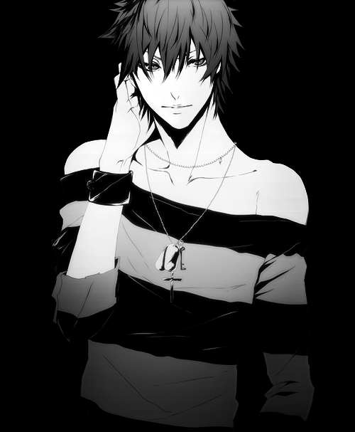
What makes “Hitman Reborn!” and other series unique from the others is that the males are depicted as hyper-stylized, brilliantly put-together and more than a little sleek (read: feminine) in the way they’re depicted. As a result, many of them are drawn in a style that more closely approximates fashion sketches than as cartoons or superheroes.

This raised a few questions; are these new artists failed fashion designers or are they simply highly evolved cartoonists? This sleek, verging-on-androgynous artwork has consequently opened doors comics forefathers like Chester Gould and Will Eisner never dreamed of, initiating a decadent new comics genre unique to Japan: Yaoi.

Yaoi, to put it mildly, is homoerotic manga porn written and drawn by women showing delicate boys having sex. This is mostly aimed at women who seem to go for this sort of thing; these comics don’t really have much of a large gay following - many Japanese gays find the comics ridiculous. And yes, there’s a Yaoi-Con (of course) that takes place annually in San Francisco. Last year it moved down to Long Beach, California.

The bottom line, as I see it, though is that there’s something happening here, what it am is prezackly clear. Comics are looking more like swanky fashion sketches, and Japan leads the way in providing a highly sophisticated alternative to all that bad ultra-vi cluttering up the racks at the comic books stores.

Thursday, October 25, 2012

Happy Birthday Jim Steranko

This year’s annual Scorpio birthday tribute goes out to comics legend Jim Steranko. Along with Neal Adams, Steranko brought a maturity to comics in the late Sixties that completely changed the way people saw comic books, Adams with DC’s Deadman in Strange Adventures comics and Steranko in Marvel’s Nick Fury, Agent of S.H.I.E.L.D. Jim Steranko brought graphic style in a medium that was still mostly stuck in exaggerated, cartoony caricatures. Steranko’s art style brought comics into the Swinging Sixties, incorporating elements of Pop Art, colorful psychedelia, and cinematic images mostly influenced by Mario Bava films (ref. Black Sabbath, Danger: Diabolik, Blood and Black Lace, etc.).

A Jim Steranko comic book cover leapt off the stands every month; no other comic on the newsstand even looked like his or even came close. Steranko’s first work for Marvel was Nick Fury, Agent of S.H.I.E.L.D., a poor cash-in on the James Bond spy movie craze featuring a post-war Sgt. Fury with a few of his Howling Commandos on board (Dum Dum Dugan and Gabe Jones). The series was barely breathing oxygen providing support to the superior Doctor Strange in Strange Tales Comics. Steranko originally drew layouts for Jack Kirby in the series but eventually took over the art reins, then taking over the writing reins from Stan Lee and Roy Thomas, gaining complete control over the series and taking it places not seen in comics at the time.

One of the best examples of Steranko’s graphic genius is the legendary cover to Agent of S.H.I.E.L.D. #4, often imitated to the point of even The Simpsons comics doing a tribute to the cover. In addition to Agent of S.H.I.E.L.D., Steranko blew minds with his work on Captain America, X-Men, and a cover for The Incredible Hulk that has to be seen to be believed!

A new Steranko comic release in 1967-68 was as eagerly anticipated as a new Beatles single, in that it heralded an exciting new way of seeing things. A lot of other kids must have agreed with me because they were some of the fastest selling comics to fly off the stands. It took me years to score Agent of S.H.I.E.L.D. #1 because it instantly sold out on release.

Jim Steranko, born November 5, 1938 in Reading, Pennsylvania, grew up working in carnivals as a fire-eater, magician, and later resorted to burglary. He also got heavily into playing guitar in various local bands. After a period of commercial art, Steranko moved over to illustrating several short-lived superhero series for Harvey Comics.

Steranko’s legendary work for Marvel gave him artistic control that included splash pages in the middle and end of the comic, sometimes even taking up two pages, unheard of at the time. He also colored his own comics, a first at the time. All this artistic freedom eventually came to a head when Marvel big kahuna Stan Lee began heavily editing Steranko’s previously untampered work,creating major friction between the two men.

Steranko’s next move was to start his own publishing company Supergraphics, which produced the Steranko History of Comics in 1972, one of the earliest academic studies on the history of comics. By the 1980’s he published Prevue Magazine, an aggressively heterosexual movie magazine that always managed to plug in a few photos of Sybil Danning and Steranko clutching some hot, new young blonde action movie starlet.

Jim Steranko was inducted to the Will Eisner Hall of Fame in 2006, and continues to this day to be a major influence in comics art. Like a Sam Fuller film, Henry Moore sculpture, or Captain Beefheart album, once you’ve seen a Jim Steranko comic you know you’ve seen something incomparable and unforgettable.

Friday, May 29, 2009

Fan Art Gone Wrong, Very Wrong!


There are two kinds of comic book fans, Marvel fans and DC fans. Since I'm a DC comics fan I never warmed up to Marvel much. Nevertheless, I always found the God-like status paid to megalomaniac Stan Lee to be extremely obscene. When I heard there was a group show at Hollywood's own Gallery 1988 paid to Stan Lee, not Marvel Comics and the hard-working geniuses who worked under him, I was intrigued. How does a self-loving prick like Stan Lee rate a show? Will Jack Kirby's ghost show up and take a dump on Lee's worn-out toupee?

Tributes like this I would accept like a burning spear hemorrhoid, which would probably resemble Spiderman. There were few paintings that actually could be called "art" and most of it was just plain bad. Let's cast the swine before pearls: When the artists weren't busy imitating Mark Ryden or a kid's Fruit Roll-Ups ad (you know when the kids are bugging their eyes out like speed freaks), it was just bad Napoleon Dynamite fan art. I actually missed the liger!

He who (cannot be named) should have their thumbs hung:
1) He who painted Dr. Doom giving Ozzy devil metal fingers
2) Stan Lee pencil sketches
3) He who painted "The World of Stan Lee" and then cribbed a load of Jack Kirby images...you're a douche
4) He who painted Stan Lee on stage with Marvel heroes rocking out in a band called The Excelsiors...you're the biggest douche of all


I saw a terrible painting of the Hulk going for $7000 (the most expensive piece there) and it was the stupidest thing I ever saw. The horror set in when I discovered it was my next door neighbor's painting! I also a beautiful color box of Mr. Fantastic that didn't seem like art to me but belonged in some stoner teen's rec room. By the beer bong.

At least some people tried, there were paintings that had virtually nothing to do with superheroes. If they couldn't get into the comics frame of mind they should have fucked off.


Who was good?
1) There was a nice painting of Dr. Strange by Nic Cowan. Unfortunately it looked like any image from the Powerpuff Girls. Bummer.
2)Yoskay Yamamoto's painting of Thor was excellent because it was not only a cool tribute but showed an ORIGINAL art style not to be seen in the rest of the room. His lines and composition made me a fan.
3) Chris Reccardi's painting of Sue Storm/Invisible Girl was very stylized and well-done. Every line was perfectly executed, and again, he won a fan.

To Gallery 1988's credit most paintings were priced to move (under $800) so the art fan gets some great new shit...even a cool stoner light box of Mr. Fantastic.